Losing Control
Master Artist: Karl Bryullov
Current Artist: Jocelin Carmes
For this piece, I wanted to explore the feelings that are connected with our perception of what is not within our control, and the pain that can result from that. The idea of the forest on fire symbolizes the external world dissolving into what one perceives as chaos and destruction. I also wanted this piece to take the direction leaning towards contemporary problems, like global warming, and how much pain can result from the consequences of that.

18.25"x 13", acrylic paint on matte board
References & Inspiration


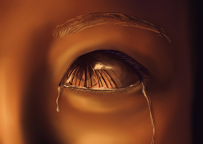
I took all of my own reference photos, and combined some of them to achieve the expression I wanted. I wanted to use the wideness of the eye and furrow of the brow to create the expression of fear and shock.


When coming up with the idea for this piece, I looked at the works of Karl Bryullov because of the way he depicted such strong emotions in the eyes of his subjects. When zoomed in on a single set of eyes, you can immediately tell what emotions are flowing through the mind. I also admire the way he conveyed such a compelling image of an end-of-the-world situation in his painting, The Last Day of Pompeii. I wanted to convey a slightly similar message, where everything has seemingly dissolved into chaos and finality.


I look at many current artists, but one in particular that I always come back to is Jocelin Carmes. I particularly love his digital paintings of fire, and the way he achieves recognizable forms in such simple shapes. He also creates a lot of surreal, atmospheric works that I love. Going into this piece, I wanted to encompass similar ideas as well as technique in terms of shape language with my flames.
Sustained Investigation
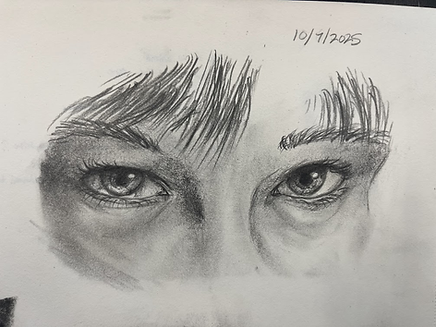


These three were all studies of the eye, the top two being the first. I felt like drawing eyes one day, and I was also exploring how I felt about graphite as a medium for a larger piece.
The left was the second study, where I worked on understanding the anatomical construction of the eye.
Additionally, I was thinking about compositions for the piece and how I would position the different parts of the eye. I wanted It to be looking off to the side, so you can tell that the eye is looking at something.
I liked how looking off to the left could set off the composition with the pupil being off centered, but would look centered when I included the nose in the final piece.
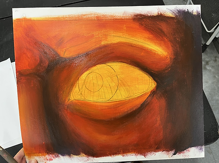
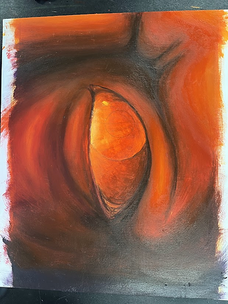
This piece was the one that made me realize what medium I wanted to use for my next selected work. I really loved blending in acrylic, and the intense lighting you can achieve with it with such ease. I wanted to explore it further in my work. Additionally, I was interested in how you mix the colors you want. For this peice, the greens were darkened with red. For my selected work, the entire painting is largely only two colors, a red orange and an indigo blue, as well as a brighter orange and yellow for highlights.


On this particular day, I was fascinated by perspective, and how you could distort perspective. I had actually never studied perspective in any form until this day, and then it made sense when I started to finally understand how to use grid lines. I explored different kinds of perspectives, which a number for different points, as well as the effects that you can achieve with curing the grid lines that are a result of those points


This was the evolution of my thumbnail sketch, with the left being my initial idea for the piece, and the right being my final thumbnail that I based my painting of of.
Part of my workflow and process is using procreate to flush out my ideas and details. I am familiar with the program and I find it easier as well as quicker to flush out ideas digitally, than to struggle and puzzle out things on paper.
With easier access to resizing tools and access to all of the colors anyone could ever imagine, I can quickly figure out how I want to approach my piece
In-Progress Photos